U.S. Regions
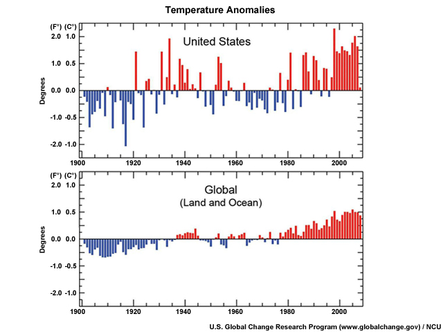
As is true over the rest of the planet, the United States has been warming, particularly in the last 50 years. Scientists have determined that much of this comes from the heat trapped by greenhouse gases emitted through human activities, such as the use of fossil fuels. Overall the average warming in the U.S. has been about 1.7°F (0.95°C) since the late 1800's.
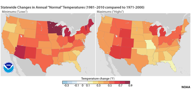
Recently, the National Climatic Data Center issued its new Climate Normals data—30-year averages of climatological variables (such as temperature and precipitation) that serve as reference points. These are used for everything from energy use projections to choosing crops and planting times. This graphic depicts the differences between the new normal, which averages annual temperatures for the period from 1981-2010, and the previous 30-year average that ended in 2000. The graphics indicate that, on an annual basis, every state has experienced warming in both the minimum temperatures (shown on the left) and the maximums (on the right), although some have warmed more than others. Average annual lows are now warmer, particularly in the desert Southwest, the Northeast, and the Great Lakes. Daytime highs have increased the most in the Southwest, Rocky Mountains, and Michigan, Wisconsin, and New Jersey.
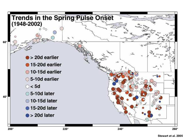
Increasing temperatures can also affect the timing of spring or early summer runoff. For many western rivers, the initial pulse of water from snowmelt is occurring about 2-3 weeks earlier. Although some of these changes can be explained by natural variability, it appears that most of the shift is probably due to global warming.
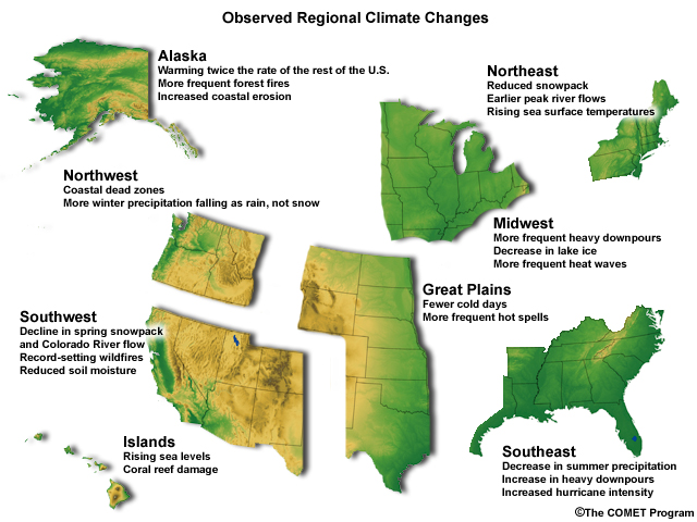
Climate systems, ecosystems, and even human systems are interrelated in many complex ways, so it is not surprising that a change in one of them affects others. This graphic shows just a few of the regional changes that have already been observed. If greenhouse gases continue to accumulate in the atmosphere, we can expect even more impacts. Some of these can be beneficial, but many can be problematic, and the effects can vary from location to location.