Is It Real?
Evidence of Change
Temperatures
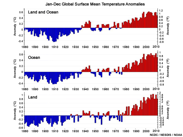
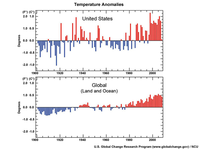
Earth is getting warmer by virtually every measure we know, and the temperature has been well above normal for more than 25 years. Although increases of 1.0-1.6°F (0.6-0.9°C) over the last century or so may not sound very threatening, remember that's a global average. The warming is stronger over land than over oceans and in the higher latitudes than in the tropics.
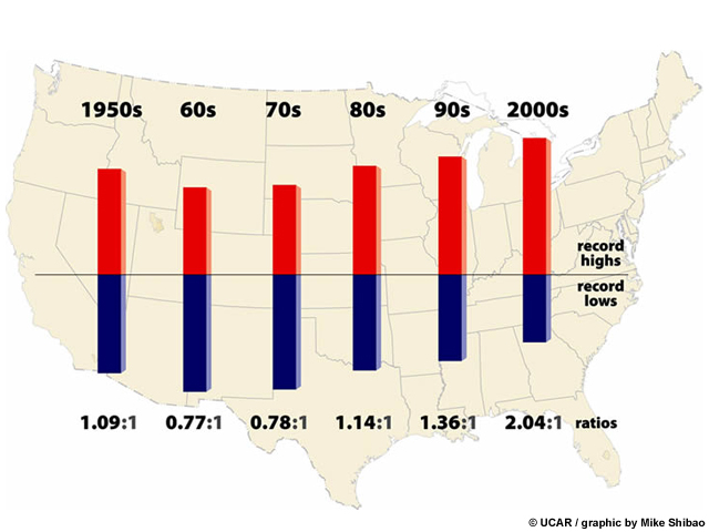
In the United States, this warming is also changing the temperature patterns. Record high temperatures are now occurring more than twice as often as record lows, and similar patterns have been observed across the planet.
What Do You Think?
Question
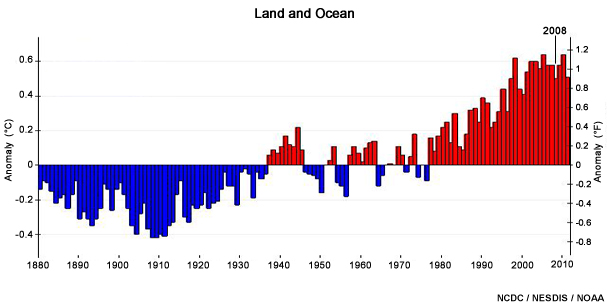
Looking at the graph, what can you conclude about the 2008 temperatures?
The correct answers are a), b) and e).
While 2008 was relatively cool compared to the other years so far in this century, it was still one of the warmest years since 1880.
But why did the temperature decrease in 2008?
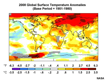
Let's look at the global map of surface temperature anomalies for the year.
Notice that much of the world (and especially the Arctic) was warmer than normal (red and orange colors), although the U.S. was fairly close to normal. This illustrates the idea that you can't just look at the weather in one area—you need to see the picture over the entire planet.
Note also the large pool of cooler (blue and green) temperatures in the Pacific Ocean. These lower temperatures reflect a strong La Niña pattern, a naturally occurring oscillation of tropical ocean temperatures that also shape weather patterns. So how did the 2008 La Niña affect the picture?
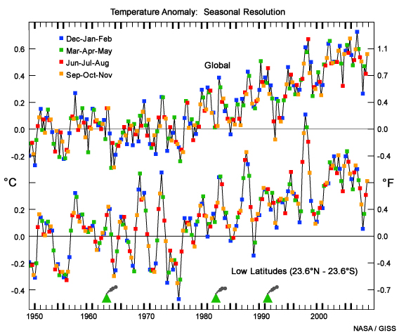
Looking at the seasonal temperatures, we can see that the La Niña cooling cycle was strongest in the low latitudes and that it bottomed out in the winter (December 2007 through February 2008). Once the La Niña pattern relaxed, temperatures bounced upward again. This is a good example of natural climate variability superimposed on the global warming signal.
Oceans
Ships, buoys, and satellites that dot the globe tell us the oceans are heating up too. The top 1,000 feet (300 meters) or so of the ocean have warmed by 0.5°F (0.3°C) over the past 50 years. The deep sea, too, has warmed. A NOAA study that looked at the period from 1948 to 1998 found that every ocean warmed to at least 3,300 feet (1,006 m).
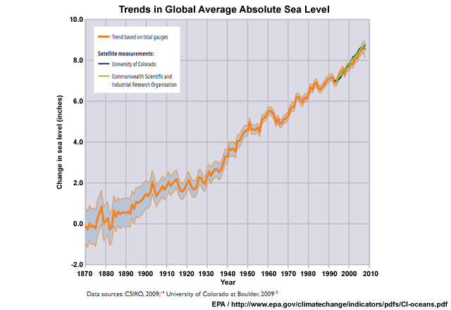
And as air and oceans warm, the seas have risen. All together, the IPCC estimates the oceans rose 4 to 10 inches (10-25 cm) in the 20th century from melting ice and snow and the physical expansion of warmer water. The average rate of increase has been 0.06 in. (0.15 cm) per year from 1870 to 2008. From 1993 to 2008, average sea level rose roughly twice as fast as the long-term trend, at a rate of about 0.12 in. (0.30) per year.
Sea levels aren't the only way oceans change. Seawater, which is normally alkaline, is becoming less so as extra CO2 in the air is absorbed. When the gas dissolves in the ocean, it reacts with carbonate ions to form carbonic acid. As a result, the oceans are now 30% less alkaline than they were just 100 or so years ago.
Though that doesn't sound like a big deal, it means times will be much harder for ocean creatures like coral, plankton, and shellfish that depend on abundant carbonate ions as raw material for shell-building. If populations of these organisms plummet, the fish that eat them and the millions of people that eat the fish will suffer as well.
Snow and Ice
Snow and ice reflect the sun's energy back to space. Without this white cover, more water can evaporate into the atmosphere where it acts as a greenhouse gas, and the ground absorbs more heat. Snow and ice are melting at rates unseen for thousands of years, and this has profound climate consequences. As with air temperature, most of the melting in our 100 years or so of official record keeping has occurred after 1980.
Spring snow cover has decreased since 1922 at an average rate of about 2% per decade in the Northern Hemisphere, including a steep 5% drop during the 1980s. River and lake ice don't last as long as they used to either. As permafrost melts in the vast northern tundra, trees locals colorfully call "drunken trees" are falling over and buildings are crumbling as the ground disintegrates beneath them.
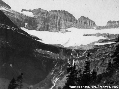
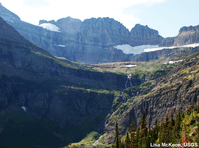
With a few exceptions, glaciers have been shrinking across the globe. In Glacier National Park, for example, there were 150 glaciers in 1850. Today, there are 26. In Switzerland, the Tortin Glacier, which supported a local ski area, shrank so much that the Swiss put a city-block sized insulating sheet over the glacier's edge to slow its retreat.
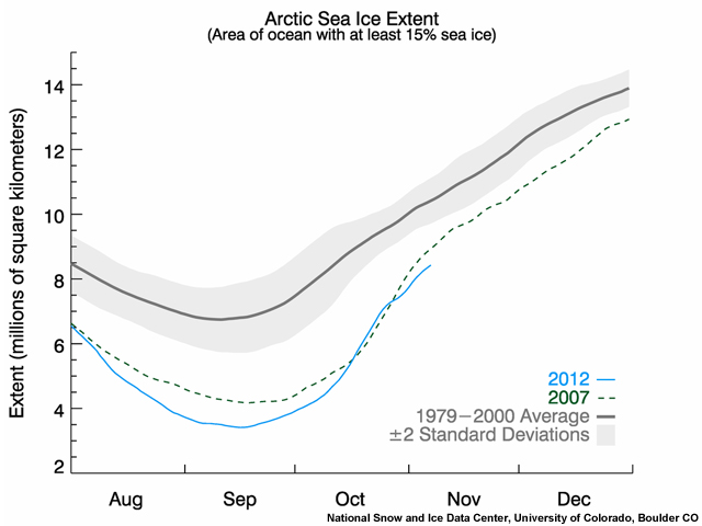
Sea ice is dwindling too, especially in the Arctic. Satellites have observed winter Arctic sea ice shrink by about 3-4% per decade from 1979, and an even higher rate in summer.
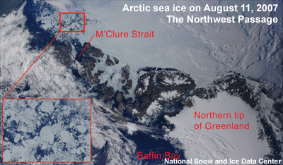
In summer 2007, the Northwest Passage north of Canada became navigable for the first time as the polar cap melted to its lowest level to that date—30 years faster than IPCC scientists had predicted.
Rain and Drought
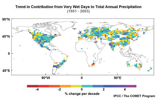
More water vapor held by a warmer atmosphere also leads to heavier rains and more snowfall. In particular, heavy rains are increasing in temperate zones. For example, in the continental United States, intense precipitation increased by 20% over the past century, while total precipitation increased 7%.
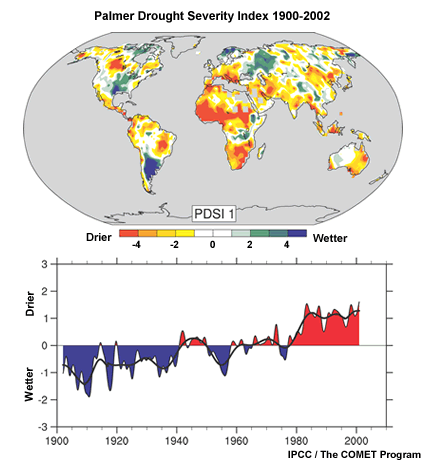
More evaporative power doesn't just mean more rain—paradoxically, it also means that some areas get drier as storm tracks shift. A 2004 study by the National Center for Atmospheric Research found that the percentage of Earth's land experiencing serious drought had more than doubled since the 1970s.
And, along with drought, wildfires have become more widespread recently across the U.S. and Canadian West.
Ecosystems
Increased warmth has also affected living things. Plants and animals are experiencing longer growing seasons across the Northern Hemisphere. For example, the Japanese keep very detailed records on the blossoming of their Tokyo cherry trees, so they know they are blooming 5 days earlier on average than they were 50 years ago.
Mosquitoes, birds, and insects are also moving north in the Northern Hemisphere. The pine beetle, a native pest of lodge pole and jack-pine trees, has chewed up tens of thousands of square miles of forest across North America, staining the green forest with the rust of dead needles. A 2008 Nature article attributed their move northward and to higher elevation forests to warmer winters, hotter summers, and less rain. To make matters worse, the scientists projected that the beetles themselves could become a force for climate change. For example, the carbon released by the decay of the trees they have killed in British Columbia may cause the forest to emit more carbon than it absorbs.
U.S. Regions
As is true over the rest of the planet, the United States has been warming, particularly in the last 50 years. Scientists have determined that much of this comes from the heat trapped by greenhouse gases emitted through human activities, such as the use of fossil fuels. Overall the average warming in the U.S. has been about 1.7°F (0.95°C) since the late 1800's.
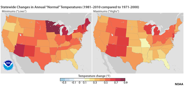
Recently, the National Climatic Data Center issued its new Climate Normals data—30-year averages of climatological variables (such as temperature and precipitation) that serve as reference points. These are used for everything from energy use projections to choosing crops and planting times. This graphic depicts the differences between the new normal, which averages annual temperatures for the period from 1981-2010, and the previous 30-year average that ended in 2000. The graphics indicate that, on an annual basis, every state has experienced warming in both the minimum temperatures (shown on the left) and the maximums (on the right), although some have warmed more than others. Average annual lows are now warmer, particularly in the desert Southwest, the Northeast, and the Great Lakes. Daytime highs have increased the most in the Southwest, Rocky Mountains, and Michigan, Wisconsin, and New Jersey.
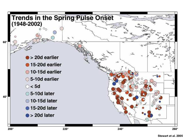
Increasing temperatures can also affect the timing of spring or early summer runoff. For many western rivers, the initial pulse of water from snowmelt is occurring about 2-3 weeks earlier. Although some of these changes can be explained by natural variability, it appears that most of the shift is probably due to global warming.
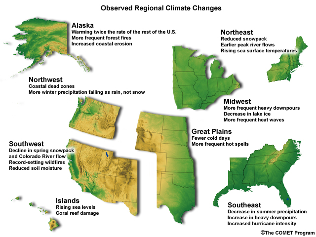
Climate systems, ecosystems, and even human systems are interrelated in many complex ways, so it is not surprising that a change in one of them affects others. This graphic shows just a few of the regional changes that have already been observed. If greenhouse gases continue to accumulate in the atmosphere, we can expect even more impacts. Some of these can be beneficial, but many can be problematic, and the effects can vary from location to location.
The Human Element
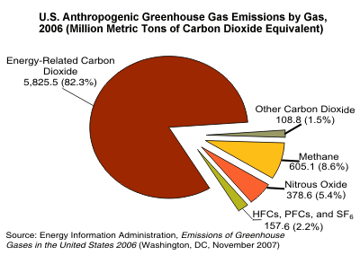
The Human Element: CO2
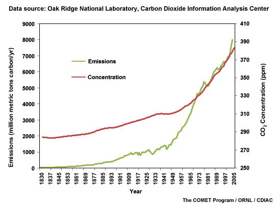
In pre-industrial times, carbon dioxide made up about 280 parts per million atmospheric molecules. In 2008, it makes up about 385 parts per million—30% more. So what's the big deal about a few hundred parts per million? Not only is the present atmospheric carbon dioxide concentration higher than it has been for at least 800,000 years, the rate of change is accelerating. Previously it never exceeded 30 parts per million per thousand years, but now, carbon dioxide has risen by 30 parts per million in the last 17 years.
Worldwide, burning fossil fuels is the major source of CO2, but CO2 can also come from cutting trees, burning forests or grasslands, agriculture, and interestingly, making cement.
What Do You Think?
Emissions by Country
Question
What country/group do you think had the highest total CO2 emissions in 2007?
The correct answer is b).
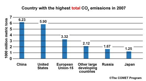
According to data from the Netherlands Environmental Assessment Agency, China passed the U.S. in 2006 and is now the largest emitter of CO2. Notice that the combined emissions of the EU-15 group and the large developing countries group are lower than the U.S. emissions.
Question
What country/group do you think had the highest per capita CO2 emissions in 2007?
The correct answer is a).
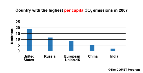
On a per person basis, the United States, with a population of 0.31 billion people, emits more than twice as much as the citizens of the EU-15 and about 10 times as much as 1.14 billion people in India.
The Human Element: Other Greenhouse Gases
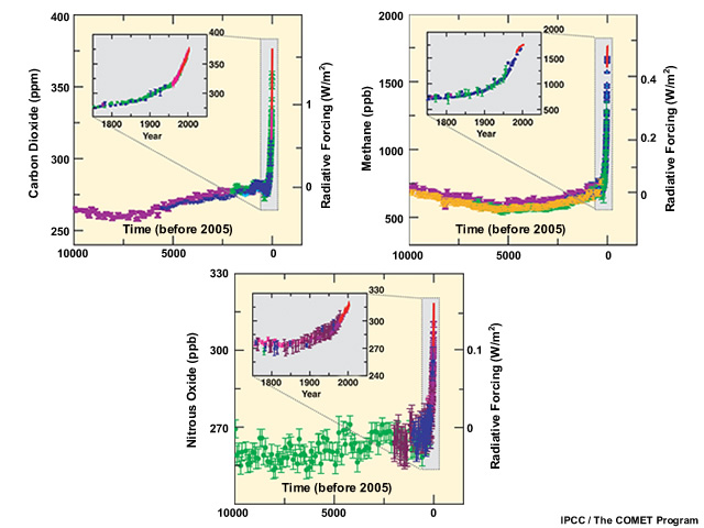
Carbon dioxide isn't the only greenhouse gas climbing alarmingly fast. Methane is now about 1,780 parts per billion. During the last 650,000 years, it never exceeded 790 parts per billion. And worryingly, methane has begun building up in the atmosphere again after stabilizing between 1999 and 2006. Some evidence points to melting permafrost across the Northern Hemisphere, where decaying plant material produced methane that was frozen in the tundra for millennia.
Nitrous oxide (N20) is another greenhouse gas produced by both natural and human-related sources. Less of this gas is emitted than CO2, but it is a more powerful heat trapper on a per molecule basis and has an atmospheric lifetime of 120 years.
Some industrial chemicals, such as fluorinated gases, are considered to be "high global warming potential gases" because of their potency and long atmospheric lifetimes. For example, nitrogen trifluoride, a cleaning agent used in making flat panel TVs, computer monitors, and thin-film solar panels, has increased 30-fold since 1978 and is thousands of times more powerful as a greenhouse gas than carbon dioxide.
The Human Element: Are Humans the Cause?
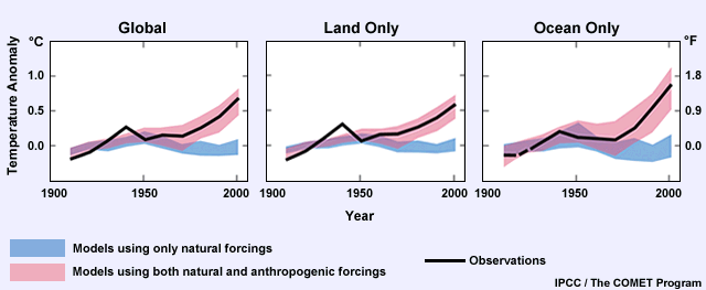
But couldn't the warming still be a natural variation? Scientists have looked for alternative explanations based on what caused climate changes in Earth's past. None of them fit the bill. Computer models help cinch the case for a human cause. The solar and volcanic conditions of the last 50 years would likely have produced cooling, based on our models' best estimates. Only the addition of the extra greenhouse gases and particles to our computer models can reproduce the pattern of warming we've seen over the past century.